
Introduction:
A key to developing a colour scheme that appeals to users is an understanding of colour psychology in UX design. Although some designers may view colour as solely aesthetic, colour actually plays a significant role in a design’s psychological influence on consumers and, consequently, its user experience (UX).
A poorly considered or subpar colour scheme can hinder a user’s ability to use a website or app and negatively impact their entire experience, but a well-planned UX colour scheme can take a design from “good” to “great.”
Psychology of Colors in UI/UX can be seen in twos. Designers can gradually incorporate UX colour best practices into their designs without having to completely rethink their process, even though colour theory in UI design is a complex subject and the use of colour in UX design covers much more than just creating an attractive palette (such as accessibility and the psychological effects of even different shades within the same hue). Learning to use more surprising colours in designs is one of the most satisfying aspects of colour theory for designers who have mastered the fundamentals.
Any design agency or organisation should be able to use and apply colour psychology into the fabric of their business.
Understanding Color Psychology
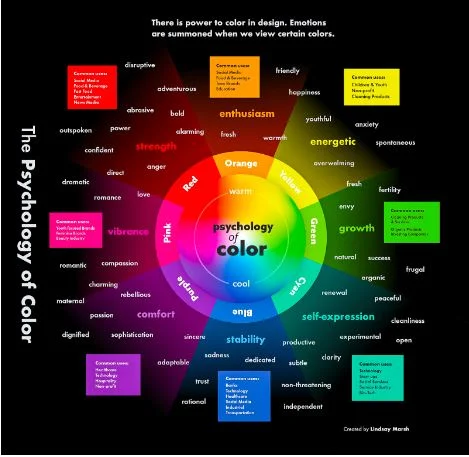
The study of how colours influence human behaviour and mood is known as colour psychology. This branch of study is predicated on the notion that people are psychologically affected by various colours in different ways, and that these effects can be used to affect mood and behaviour.
Colours can significantly affect mood, perception, and even physical reactions, according to research. For instance, cool hues like blue and green are connected to calmness and relaxation, while warm hues like red and orange are linked to excitement and vitality.
Gaining insight into these linkages between colours and the psychological impact of colour can aid designers in producing user experiences that are more impactful. Designers can evoke particular feelings and actions in consumers by selecting the appropriate colours for their designs.
Define color psychology and its role in design
Color psychology is the study of how colors influence human emotions, behavior, and perceptions. It recognizes that different colors evoke specific psychological and emotional responses in individuals, and these responses can be harnessed to impact decision-making, mood, and overall user experience. In design, color psychology plays a crucial role as it enables designers to strategically choose colors that align with the intended message, purpose, or user interaction. Let’ see how it impacts users.
Color Impact on User Perception
User behaviour and colour
In UX design, colour may greatly influence user behaviour. A call-to-action button, for instance, might attract the user’s attention and motivate them to act by utilising a vivid, contrasting colour.
However, applying a subdued colour to a non-essential feature might assist cut down on visual clutter and direct the user’s attention to the design’s most crucial elements. Colour can also be utilised in a design to establish visual hierarchy. UI UX Design Company may help people traverse a design more easily by employing colour to indicate different levels of importance.
Emotional design and colour
In emotionally charged design, colour may also be quite significant. The process of creating goods that make users feel a certain way—like joy, enthusiasm, or calmness—is known as emotional design.
The user experience can be improved and emotional connections with users can be made by designers through the use of colour. For instance, incorporating cold hues like blue and green into a design can evoke a sense of peace and relaxation, while using warm hues like red and yellow can evoke feelings of enthusiasm and vitality.
It’s crucial to remember that not everyone reacts emotionally to colour. When utilising colour to evoke strong feelings in an audience, it’s crucial to keep in mind that different cultures and people may associate different emotions with different hues.
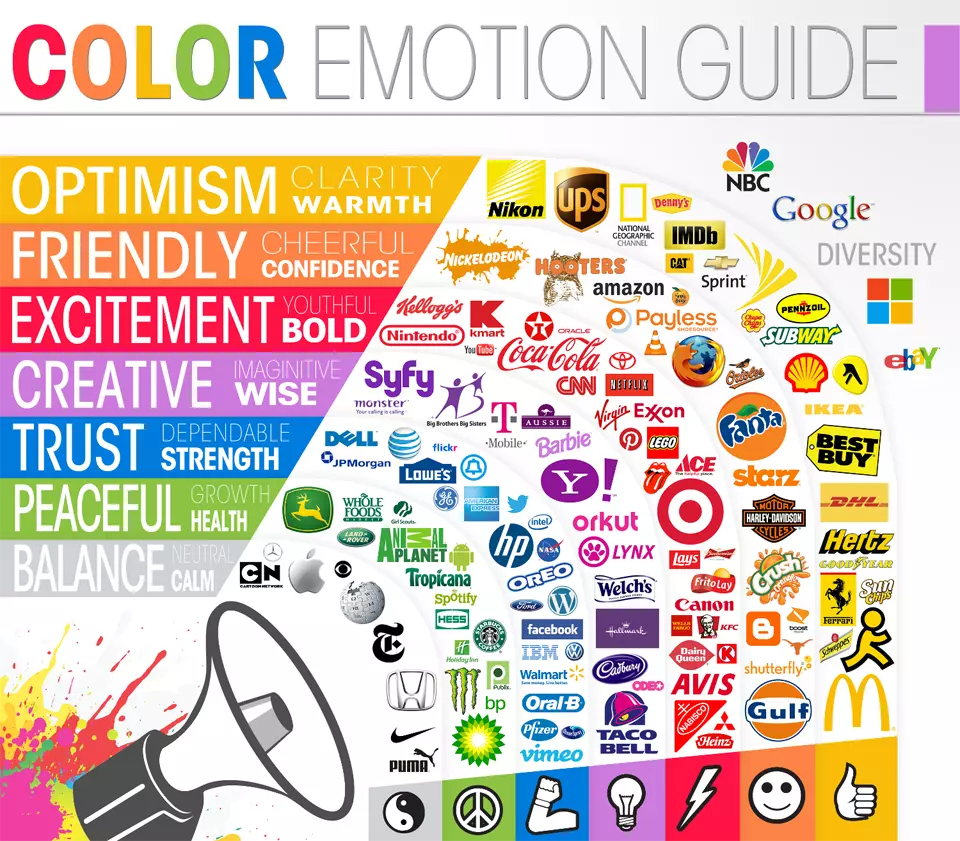
Utilising colours in branding
Another crucial component of branding is colour. A brand’s colour scheme can assist establish a strong sense of identity for the company by evoking in consumers particular feelings and connections. For instance, technological brands frequently employ the colour blue to imply dependability and credibility. Green is a popular colour for eco-friendly brands to represent sustainability and environmental consciousness.
When choosing colours for branding, it’s critical to take into account the target audience’s potential emotional connections with the colours as well as the brand’s values and message.
Practical Applications in UI/UX Design
The following useful advice on utilising colour in UX design is provided:
- Utilise colour to direct consumers through the design and establish a visual hierarchy.
- To get the user’s attention, utilise contrasting colours for call-to-action buttons.
- To cut down on visual noise, choose muted colours for non-critical areas.
- For elements that need attention or vitality, choose warm colours like orange and red.
- When designing aspects that need to be serene or relaxing, choose cool hues like blue and green.
- When selecting colours for a design, take into account the feelings that each one evokes.
- To make sure the colours are successful in evoking the desired feelings and behaviours, test the design on members of the intended audience.
Conclusion:
In UX design, colour is a key factor in influencing user behaviour and emotion. Thus, a thorough understanding of colour psychology and how it affects user behaviour and emotion is crucial to designing user experiences that work. Designers may direct consumers through a design, elicit specific behaviours, and establish emotional connections with them by deliberately employing colour.